Design the invitation before the spectacle
A portal is a persuasive exhibition device. It can mark the transition from everyday life into a game universe with very little explanation. But a threshold also communicates who is expected. A narrow opening, a dark approach or an unavoidable sound effect can turn an invitation into a warning before a visitor has had any opportunity to choose.
Begin the spatial brief with arrival information. Explain the approximate character of the visit, where seating can be found, which areas contain intense effects and whether an alternative route is available. Provide this information before booking where possible, not only on a sign that someone encounters after travelling to the venue. Predictability is part of hospitality.
A powerful entrance does not have to conceal everything that follows. A glimpse of the next space can help a visitor judge whether to proceed. Someone who chooses a quieter route should still encounter the exhibition’s central argument, rather than being diverted into a corridor of practical compromises.
Plan for more than the person at the controls
Interactive stations create social arrangements. One person plays, another watches, a third waits and a member of staff explains. If the plan includes only the footprint of the equipment, these surrounding activities will occupy circulation space by accident. Map them deliberately, including where a mobility aid, companion or assistance dog may be positioned.
A seated visitor should be able to approach, see and operate the intended experience without being treated as an exceptional case. Test the reach to controls, the angle of the screen, the space beneath a surface and the visibility of captions. Avoid assuming that a single lowered station makes an otherwise inaccessible installation equitable.
Exact dimensions must be resolved with qualified access and building specialists under the rules applicable to the venue. ISO 21542 is a reference for accessibility and usability of the built environment, not a substitute for local requirements. In France, requirements for établissements recevant du public need project-specific review. A scenic drawing alone cannot establish compliance.
Give intensity an edge, not the whole room
Game exhibitions often borrow the sensory vocabulary of games: dramatic contrast, amplified sound, moving images and immersive projection. In a public gallery, however, visitors cannot always adjust those settings as they would at home. Design intensity as a bounded choice, with advance information and an intelligible way around it.
Sound spill is an interpretive problem as well as a comfort problem. Two competing narrations can make both inaccessible. Use acoustic testing, directional strategies where appropriate and captions or transcripts that stand on their own. Headphones are one option, not a universal answer; some visitors cannot use them comfortably or need to remain aware of companions.
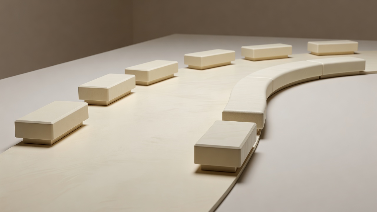
Consider glare on screens and labels, the legibility of text against scenic surfaces and the transition between bright and dark zones. Provide meaningful seats with useful sightlines rather than placing all rest at the exit. A pause can deepen attention. It is not evidence that the exhibition has lost momentum.
Access is not a second route to the same spectacle. It is part of deciding what the encounter should be.
Test a journey with people, not just a plan
Invite disabled participants into paid, appropriately supported testing early enough to change the proposal. A consultation after fabrication is useful for identifying problems, but it offers fewer opportunities to solve them well. Include varied needs and acknowledge that one participant cannot represent an entire community.
A full-scale mock-up can reveal what a polished rendering conceals: a caption blocked by someone’s shoulder, a queue that hides a route marker or a control that is technically reachable but exhausting to hold. Observe arrival, approach, use, withdrawal and movement onward. These transitions are often where the greatest friction occurs.
Digital access should connect with the physical plan. WCAG 2.2 offers testable criteria for web content, including keyboard operation and contrast, but does not certify an entire physical installation. The W3C Web Accessibility Initiative provides supporting guidance. Xbox accessibility resources and AbleGamers can inform questions about play, without replacing direct consultation or venue-specific expertise.
Keep access alive after opening
A workable design can deteriorate in operation. Temporary signs migrate into turning spaces, a bench becomes storage and an alternative controller remains locked away. Include access checks in the daily opening routine and give staff a clear way to report barriers without waiting for a complaint.
Record what changes during the run. The exhibition’s most valuable spatial learning may come from a visitor who uses the room in a way the design team never anticipated. Treat that observation as knowledge to carry forward, not as an exception to explain away.
Continue the series
Make participation matter